Total components
Overview
Component-based design is the cornerstone of the modern UI development process. With rise of more UI frameworks every day, the web platform has a serious issue of fragmentation and portability.
Web components to the rescue! This is the collection of web components (WC here forward) that we use at RanchiMall, especially since we are a framework-less development environment so this was a logical choice.
Features
- Native and Cross framework support
- Encapsulated style and functionality
- Easy styling
- Adaptive scaling
Quick Start
- To start using these components, Select the ones you want to add to your project. You can un-check 'get minified' to get the readable code.
- Now you can download or copy the source code for selected components. You might get a warning while downloading like this file is not safe, please allow the download as this is caused when downloading files with '.js' extension. These components are 100% safe to use.
-
Link the downloaded js before </body>
Global styling
These components use CSS variables to customize styling. they share some CSS
variables that make global styling easier.
Of course you can set these variables at individual component CSS rule set level.
Some common CSS variables and their use
Variable
Use
Color which will be used for denoting active state
default text color for all components.
( Use comma separated rgb values. e.g 17, 17, 17 )
default background color for all components.
( Use comma separated rgb values. e.g 255, 255, 255 )
Used for error/invalid state
Buttons
Variants
These are styled variations of base component
Variant type
Example
How to define variant
States
Disabled
To disable the button add disabled attribute.
Attributes
All the native HTML checkbox attributes are valid
Attribute
Description
Button is disabled by default. all the interactions are disabled
Has values submit reset
Can only used withing
Styling
CSS variables used to style this component
Variable
Description
Define background of button. accepts all values of CSS background property
Set curvature at button corners
Specify padding of button
Carousel
Carousel is a very common UI component primarily used to display images or slides. This carousel switches user interactions based on type of input devices present. For hover capable devices slides can be scrolled with buttons and on touch enabled devices swipe can be used.
Interactive demo
Title
Lorem ipsum dolor sit amet, consectetur adipisicing elit. Provident, optio.
Title
Lorem ipsum dolor sit amet, consectetur adipisicing elit. Provident, optio.
Title
Lorem ipsum dolor sit amet, consectetur adipisicing elit. Provident, optio.
Title
Lorem ipsum dolor sit amet, consectetur adipisicing elit. Provident, optio.
Custom attributes
These attributes cane used to customize carousel behaviour and features
Attribute
Description
Has values start center end Specifies how carousel items should align. default is center.
if added carousel shows dot indicators of carousel items.
Styling
CSS variables used to style this component
Variable
Description
Defines background color of active slide indicator
Defines background color of carousel navigation buttons
Defines box shadow of carousel navigation buttons
Defines fill of arrow icon on carousel navigation buttons
Checkbox
sm-checkbox supports all the attributes of native HTML5 checkbox
linking some HTML element with sm-checbox using label tag won't work.Add the element inside the opening and closing checkbox tag.
Interactive demo
States
Checked
To make checkbox checked by default add checked attribute.
Disabled
To disable the checkbox add disabled attribute.
Attributes
All the native HTML checkbox attributes are valid
Attribute
Description
If present, checkbox is set to checked state as default.
If present checkbox is set to disabled state. all the interactions are disabled
Sets value of checkbox which can be accessed by value property with JS
Styling
CSS variables used to style this component
Variable
Description
Defines color of un-checked checkbox border
Defines border-radius of checkbox square
Defines height of checkbox
Defines width of checkbox
Copy
Interactive demo
Usage
Attributes
Attribute
Description
Defines content that will be copied when copy button is clicked
Styling
CSS variables used to style this component
Variable
Description
Defines background color of copy button
Defines border-radius of copy button
Supported events
Event
Description
Fired when text is copied by user.
File input
<file-input> is essentially native <input type="file"/>
with added style.
So every attribute supported by native file input is supported as can be used in exactly same way.
Interactive demo
Attributes
Attribute
Description
One or more unique file type specifiers describing file types to allow
What source to use for capturing image or video data
A FileList listing the chosen files
A Boolean which, if present, indicates that the user may choose more than one file
Form
Browser support for web components form validation or form submition is not perfect. so to circumvent this problem <sm-form> can be used.
Interactive demo
Supported functions
Function
Description
When this function is called upon form element. all the form elements (sm- form components only) will be reset to default state.
Nested element behaviour
Element
behaviour
Whenever enter is pressed inside an active sm-input, this
will fire click event.
This will also change state depending opon validation conditions.
When clicked, the whole form will reset.
Hamburger menu
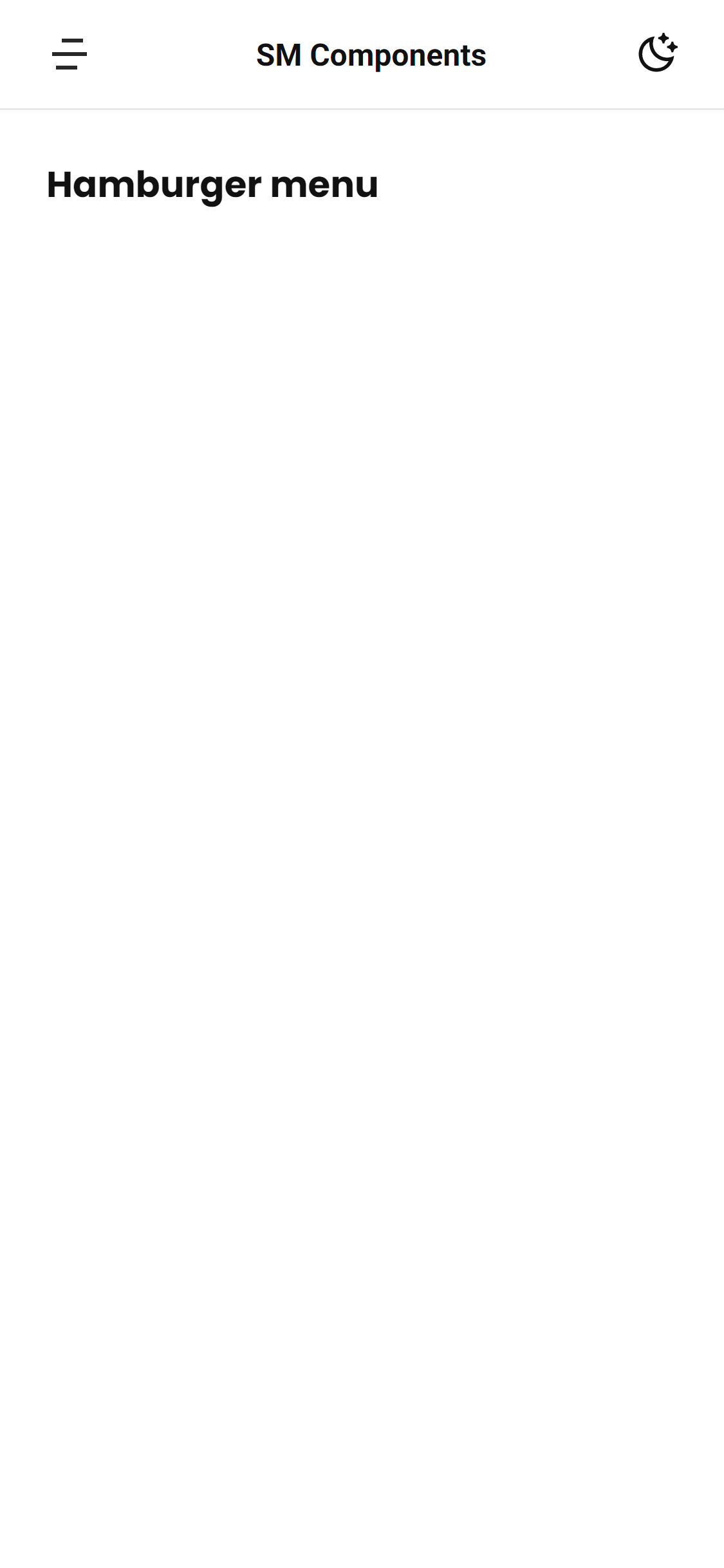
Hamburger menu closed
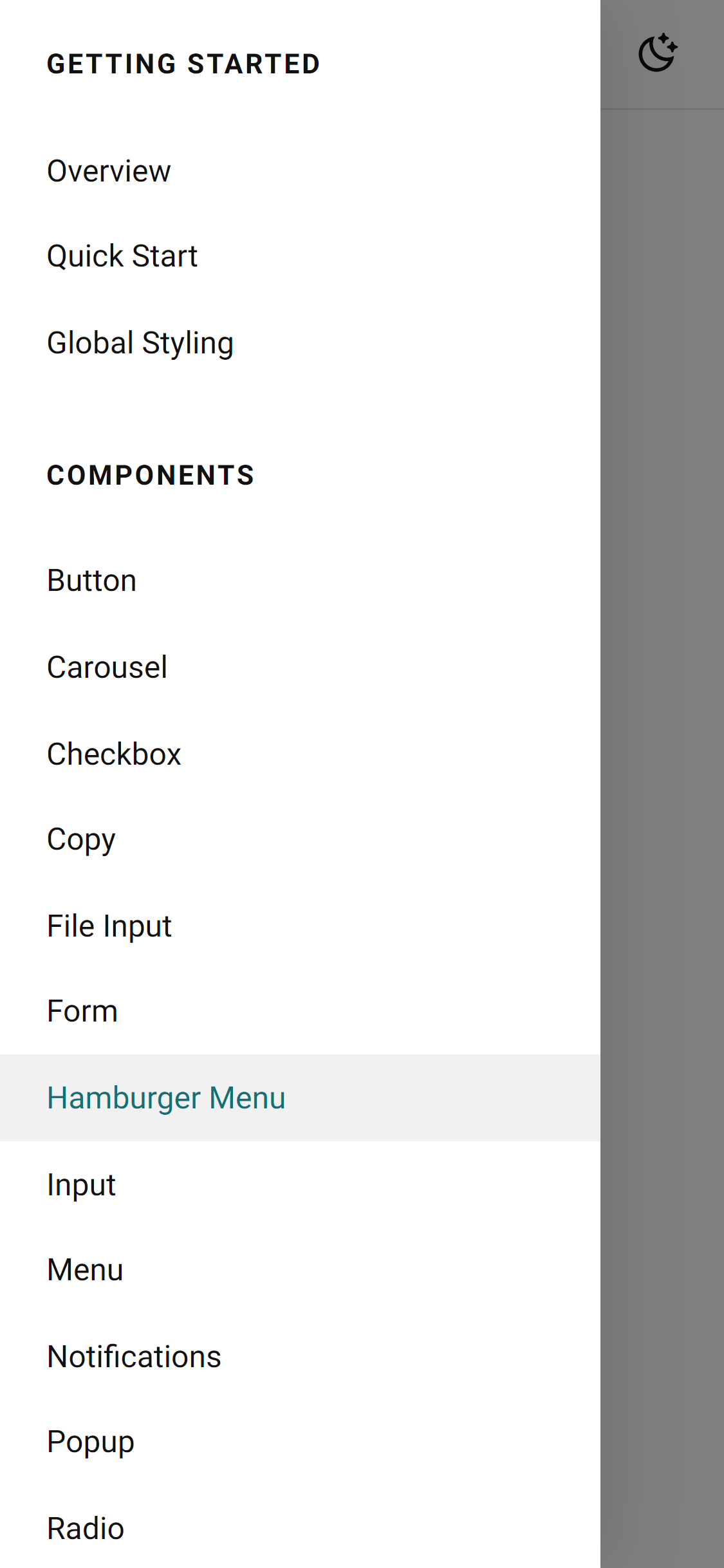
Hamburger menu open
Usage
Input
Interactive demo
Variants
outlined is only one styled variation. Default is filled which doesn't require variant specified.
Custom Attributes
All the native HTML input attributes are valid. These are additional attributes which can be used to add more functionality
Attribute
Description
If present, placeholder of input will be animated to occupy space above enterned text instead of vanishing.
Message specified as value of this attribute will be shown if validation fails.
Styling
CSS variables used to style this component
Variable
Description
Defines background property of input. Any valid CSS background values are supported.
Sets border-radius of input.
Sets space between input icon and input box. Default is "0.5rem"
Sets font size of input text. Default is "1rem".
Sets padding around whole input box including icon.
Sets width of input box.
Supported functions
Function
Description
To give focus to this component use this function instead of focus()
When this function is called value will be set to empty string.
Custom Setters
Function
Description
If you want to perform custom validation on input value, set the desired validation function.
Set disabled state to true or false
Sets the value of input with JS
Menu
Interactive demo
Custom Attributes
Attribute
Description
Specifies alignment of options relative to left or right edge of menu button.
Valid values are left right.
Supported events
Event
Description
To setup functions on click event. use standard method to add event listeners on options themselves or delegate event on menu component level.
Notifications
To start using notifications add the <sm-notifications> at top level of markup like just below starting <body> tag.
Supported functions
Function
Description
Used to display notifications with two parameters.
Notification text and notification options.
Removes all the notifications present in notification drawer.
Push() options
Property
Description
To display custom icon with notification icon option can be used.
If set true notifications won't disappear after some time. they need to be dismissed by user manually.
Interactive demo
Popup / dialog
Popups are used to show addition UI elements that you may want to hide at first and reveal them when needed.
Interactive demo
Title
Lorem ipsum, dolor sit amet consectetur adipisicing elit. Dolore tenetur natus, pariatur beatae veritatis debitis repellat laudantium corporis velit adipisci!
Title
Lorem ipsum, dolor sit amet consectetur adipisicing elit. Dolore tenetur natus, pariatur beatae veritatis debitis repellat laudantium corporis velit adipisci!
Usage
Custom Attributes
Attribute
Description
If present, popup will be in opened state by default. useful for development purpose.
Styling
CSS variables used to style this component
Variable
Description
Defines background property of popup backdrop. Any valid CSS background value is supported.
Defines border-radius of popup dialog box.
Defines padding of popup dialog box.
Defines height of popup dialog box.
Defines min-height of popup dialog box.
Defines width of popup dialog box.
Defines min-width of popup dialog box.
Supported functions
Function
Description
Displays the hidden popup, when called upon specified popup.
Hides the visible popup, when called upon specified popup
Show() options
Property
Description
If set true, opened popup won't be closed when clicked outside the popup area.
Custom events
Event
Description
Fired when a popup is opened, to access which popup fired the event you can use event.detail.popup within event listener
Fired when a popup is closed, to access which popup fired the event you can use event.detail.popup within event listener
Radio button
Radio buttons are useful whenever only one option needs to be selected from mutiple options. this
functionality can be
achieved by assigning same name to the group of radio buttons.
sm-radio supports all the attributes of native HTML5 radio.
Add the element inside the opening and closing sm-radio tag.
Interactive demo
States
Checked
To make switch turned on by default add checked attribute.
Disabled
To disable the radio button add disabled attribute.
Attributes
All the native HTML radio attributes are valid
Attribute
Description
If present, radio button is set to checked state as default.
If present radio button is set to disabled state. all the interactions are disabled
Can be used to group radio buttons with same name. only one radio button will be active in a group.
Sets value of radio button which can be accessed by value property with JS
Select
<sm-select> is very similar to starndatd HTML5 select and it's markup stucture is also identical.
Interactive demo
Usage
States
Disabled
To disable the select add disabled attribute.
Supported events
These are the events that will be fired when component state changes
Event
Description
Whenever a different options is selected by user the this event is
fired.
You can listen to this event and access the current value with event object event.target.value
Spinner
Just drop the sm-spinner in markup where you want to show the spinner
Switch
sm-switch supports all the attributes of native HTML5 checkbox
linking some HTML element with sm-switch using label tag won't work.Add the element inside the opening and closing sm-switch tag.
Interactive demo
States
Checked
To make switch turned on by default add checked attribute.
Disabled
To disable the switch add disabled attribute.
Attributes
All the native HTML checkbox attributes are valid
Attribute
Description
If present, switch is set to checked state as default.
If present switch is set to disabled state. all the interactions are disabled
Sets value of switch which can be accessed by value property with JS
Chips
This is a modern interpretation of classical HTML select tag. More suitable for touch devices,
Interactive demo
Sort byCustom attributes
Attribute
Description
If present, options will wrap around instead of overflowing horizontally.
Styling
CSS variables used to style this component
Variable
Description
Defines space between options. Default is "0.5rem".
Supported events
These are the events that will be fired when component state changes
Event
Description
Whenever a different options is selected by user the this event is
fired.
You can listen to this event and access the current value with event object event.target.value
Usage
Tabs
This component can be used sub-page navigation.
Interactive demo
Audio
Lorem ipsum, dolor sit amet consectetur adipisicing elit. Exercitationem esse quod quae repellat qui. Expedita fugiat voluptates beatae itaque corporis!
Video
Lorem ipsum, dolor sit amet consectetur adipisicing elit. Exercitationem esse quod quae repellat qui. Expedita fugiat voluptates beatae itaque corporis!
Usage
Audio
Lorem ipsum, dolor sit amet consectetur adipisicing elit. Exercitationem esse quod quae repellat qui. Expedita fugiat voluptates beatae itaque corporis!
Video
Lorem ipsum, dolor sit amet consectetur adipisicing elit. Exercitationem esse quod quae repellat qui. Expedita fugiat voluptates beatae itaque corporis!
There are three components that together make the tabs components.
- sm-tab-header
- sm-tab
- sm-tab-panels
sm-tab-header
This is the first half of tabs that include the tabs header and actual tab buttons.
Supported attributes
Attribute
Description
Specifies variant of sm-tab-header. Only value can be tab
Pass in the ID of respective sm-tab-panels to link them. This is how sm-tab-header communicates with sm-tab-panel on which tab or panel should be displayed.
Variants
tab is the only other variant than default style.
Audio
Lorem ipsum, dolor sit amet consectetur adipisicing elit. Exercitationem esse quod quae repellat qui. Expedita fugiat voluptates beatae itaque corporis!
Video
Lorem ipsum, dolor sit amet consectetur adipisicing elit. Exercitationem esse quod quae repellat qui. Expedita fugiat voluptates beatae itaque corporis!
Tags input
This component has a very specific use case and that is for accepting tags. Each time user presses enter or space, a new tag is created. Only unique values are allowed.
Interactive demo
Attributes
Attribute
Description
Define some string to let user know which kind of input is required.
Set a limit of tags that will be accepted atmost
Styling
CSS variables used to style this component
Variable
Description
Defines background of tags-input. Any valid CSS background property values are supported.
Defines border-radius of tags-input
Supported functions
Function
Description
To give focus to this component use this function instead of focus()
When this function is called value will be set to empty string.
Usage
Textarea
Textarea is suitable component where multiline input is required. you can either specify the number of lines textarea should expand or let the textarea expand according to user input until a max-height is reached.
Interactive demo
Variants
outlined is only one styled variation. Default is filled which doesn't require variant specified.
Supported Attributes
All the native HTML textarea attributes are valid.
Attribute
Description
If present, all the interactions will be blocked.
Sets the number of rows textarea will be expanded by default. Default is "1".
Sets the default value of textarea.
Styling
CSS variables used to style this component
Variable
Description
Defines background textarea. Any valid CSS background property values are supported.
Defines border-radius of textarea
Defines max-height to which textarea is allowed to expand. Default is "8rem"
Supported functions
Function
Description
To give focus to this component use this function instead of focus()
When this function is called value will be set to empty string.
Setters
Function
Description
Set disabled state to true or false
Sets the value of textarea with JS
Usage
Text field
This component can be used in scenarios where you need to display a name or something that user should be able to edit directly in-place instead of going to other UI element.
Interactive demo
Usage
Custom attributes
Attribute
Description
If present, text can't be edited.
Set initial text that can be edited by user.
Supported events
Event
Description
Fired when text changes are saved by user.
Theme toggle
Use theme-toggle to create light/dark theme easily with CSS variables.
When this is toggled by user the component changes the custom data attribute data-theme="" on HTML body tag to either light or dark
By default theme is set to OS level preferred-color-scheme ( supported by Android, iOS, Windows and MacOS ).
Interactive demo
HTML
CSS
Styling
CSS variables used to style this component
Variable
Description
Defines height of toggle button
Defines width of toggle button
Custom events
These are the events that will be fired when component state changes
Event
Description
Whenever theme is toggled by user the themechange
event
is
fired.
You can listen to this event and access the current value of toggle with event
object
event.detail.theme